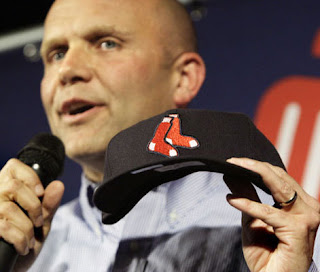
Red Sox unveil new uniforms.
The Red Sox unveiled a new logo, new road uniforms, new secondary road jersey, and a new hat that goes with the secondary road jersey.

The red sox new primary road jersey harkens back to the road jerseys they wore in the 80s. I believe the uniform in 1986 was similar but had more of a block lettering whereas this uniform has the styled font much like the current uniforms.
These aren't ugly but the lack of red is disturbing. I believe we are the RED Sox not the blue Sox. This uniform is just kind of dreary and doesn't really pop. Not sure how they expect this to increase jersey sales because it is not the kind of shirt people would rush out to buy.

Now I actually do like this jersey more. The Boston is nice and crisp red with the white outlining on the navy shirt. The shirt does have a slight batting practice feel to it. I wonder what pants they will wear with it. Probably their grey road pants. That might make it look even more batting practice like. It's not bad.
This is actually a uniform I would consider buying. If I actually bought uniforms. I wouldn't be surprised if this alternate jersey becomes more popular than the new primary road jerseys.

I have plenty to say about the hat however. I absolutely hate this one. It's not that I don't like the logo. I do like the logo. The problem lies with the outlining of the hat. If you are putting the logo on the navy hat why would you outline the logo in navy as well? Wouldn't you want to use white (or even red) in order to make it pop?
I will not be wearing this hat anytime soon. I just think the navy outlining makes it look amateurish. I wish they would give it a shot with a white outlining. Or maybe they could have put the new logo on a red hat (with the navy brim like in the 70s). That might help the logo as well. That might even be a hat I would buy.

Now these home alternate jerseys look to be very similar to the alternate home jersey they already use. The big selling point on this jersey is that it actually is red.
I liked the red jerseys before and I still like them. Not sure I would want to see them all the time but as an alternate I like it.
Overall I am underwhelmed by the changes. I don't have a good picture of the tweaked logo yet but it looks like it is just the "hanging sox" logo you see on the hat. That logo is nothing really new as it has been used by the team in the past.
Labels: Sports
